Industry
MarTech, B2B
Client
Adobe
Timeframe
Summer 2024
Role
ai assistant, disambiguation
Bridging the gap between user intent and AI understanding
Overview
During my Summer 2024 internship, I led the optimization of Adobe Experience Cloud's AI error state flow, a high-priority issue impacting user experience and business outcomes. Historically, the flow relied on users' ability to craft effective prompts, often resulting in frustration, drop-offs, and lost opportunities. With limited existing research, I took the initiative to lead weekly AI/ML meetings with senior design and engineering leaders, conducted comprehensive user testing with Maze, and implemented data-driven solutions.My work took me to three Adobe offices, including the Union Square (home office), Times Square, and headquarters in San Jose. I also had the unique opportunity to engage in a fireside chat with CEO Shantanu Narayen and meet Olympian Gabby Douglas at the Adobe Summit.
Please note: I designed the same flow using both Spectrum 1 and Spectrum 2 design systems. You might observe stylistic variations due to these different versions.
featured in adobe's product equity channel
To create a truly inclusive AI assistant, I focused on enhancing accessibility for keyboard-only users. I meticulously explored various solutions until I discovered a way to improve navigation through text within the AI assistant. By implementing refined keyboard navigation using arrow keys, users can now move through the text effortlessly. Additionally, I utilized blue-line annotation training to further refine the design, ensuring a seamless experience for everyone.
What did I work on?
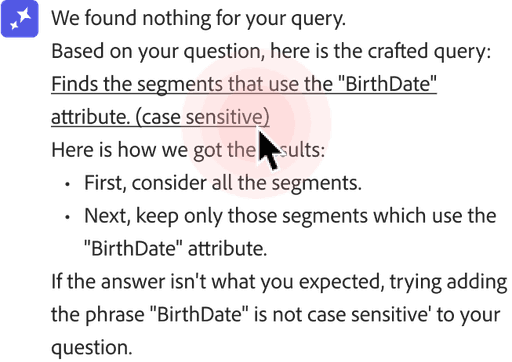
The Adobe Experience Cloud AI assistant saves businesses time and improves user satisfaction by transforming ambiguous queries into clarifying conversations, ensuring accurate responses even when initial requests are unclear, through easy-to-use visuals and proactive feedback mechanisms.
hmw transform frustrating, single-turn AI interactions into engaging, multi-turn conversations that empower users to collaboratively refine their queries and achieve their desired outcomes within the Adobe Experience Cloud platform?
Why is this needed?
Recognizing that most users struggle to effectively prompt AI, we've simplified the process, empowering them to guide the AI towards desired outcomes, thus bridging the gap between user intent and AI understanding to ensure users find the information they seek.
When does this come in handy?
This flow is triggered when a user encounters an incorrect or unsatisfactory response from the AI assistant, particularly in situations where the user has a clear understanding of the desired outcome and wants to actively participate in refining the AI's output to align with brand standards and expectations.
Who's benefitting from this new feature?
The target users for this feature within the Adobe Experience Platform are marketing and content professionals who actively create, manage, and optimize digital experiences for their brands. These individuals are typically data-driven, tech-savvy, and prioritize efficiency and personalization in their work.
What does this mean?
For users
Enhanced user control
Increased efficiency
Improved AI accuracy and relevance
Boosted confidence and adoption rates
This means a smoother, more intuitive experience with less time spent rephrasing or clarifying requests. It empowers them to find the information or actions they need quickly and easily.
For Adobe
This translates to improved user engagement and retention within the Adobe Experience Cloud platform. By reducing friction and frustration, businesses can maximize the value of their AI investment, ultimately driving increased adoption and usage of the platform's features.
How will users interact with the product?
The AI assistant clarifies ambiguous queries through quick action buttons and contextual prompts. Users can highlight specific areas of an AI response and provide feedback on each response, guiding the AI to refine its understanding and deliver accurate results.

Who'd I work with?
Senior UX Designers, UX Researchers, UX Writers, Product Managers, AI/ML Engineers, DPMs, Product Equity teams
My team and I on the final day of my internship <3
Digging deeper
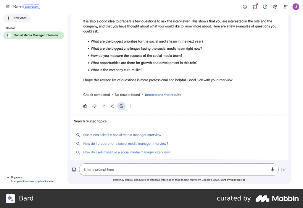
ChatGPT, Claude by Anthropic, Salesforce Einstein AI, Gemini by Google
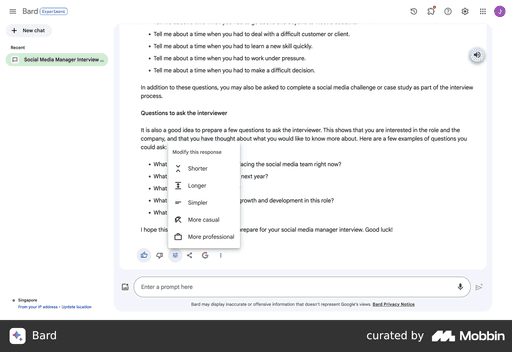
Gemini's AI assistant provides a comprehensive feedback loop, allowing users to rate, modify, and request additional context for each response. It also offers a direct link to web search for further information and highlights potential misinformation, ensuring users have the tools to validate and expand their knowledge.
Shortcomings on Gemini's part
Users criticize Gemini for not being able to answer simple questions or provide accurate information, often generating irrelevant or inaccurate responses.
How does Gemini handle ambiguity?
Gemini leverages contextual understanding and multi-turn clarification dialogues to address ambiguous user prompts. It asks clarifying questions to narrow down the user's intent and identify the specific entity or information they are seeking. They do this simply by text only, with no way to quickly respond or reroute the conversation.
hmw transform a "one-and-done" AI interaction into a dynamic conversation that guides users to their desired outcome, even when the initial response isn't satisfactory?
What are the best practices for response types?
The best practice for response types in this context is to utilize a combination of text, UI elements, and quick reply buttons.
Text
Provides clear explanations, instructions, and context for the user.
UI Elements
Visual components like images, charts, or forms enhance the user's understanding and facilitate interaction.
Quick reply buttons
Offer pre-defined responses or actions, reducing the need for manual typing and guiding the user towards relevant information or actions.
Design revisions
I introduced a novel Spectrum 2 pattern: smart responses with proactive suggestions. If the AI delivers a low-confidence answer that the user finds unsatisfactory, it prompts them to broaden their search in context, with a simple button click, encouraging continued interaction and refining the AI's understanding.
before
Previously, the AI assistant's feedback loop, while simple, lacked the ability to engage users in further conversation or problem-solving, often resulting in abandonment when the initial response was unsatisfactory.
revision
Provides clear alternatives to keep the conversation going if the initial response isn't what the user was looking for.
In between design systems
making the switch from spectrum 1 to spectrum 2
Initially, I designed within Spectrum 1 to address the urgent need for UX improvements in Adobe Experience Cloud, as the full organization hadn't yet transitioned to Spectrum 2. However, I later updated the entire flow to reflect Spectrum 2's brighter and fresher design language, ensuring consistency with the evolving platform.
Working with AI engineers
how I advocated for all users
Throughout the project, I proactively collaborated with engineers to navigate the tight deadlines. Recognizing the need for rapid iteration, I prioritized clear and frequent communication, initiating discussions to understand technical constraints and advocate for user-centric solutions. By championing accessibility and inclusive design, we were able to strike a balance between engineering feasibility and user needs, even when deadlines loomed. Collaborative jam sessions fostered a productive exchange of ideas, ensuring engineering opinions were considered while maintaining a strong focus on user advocacy. Ultimately, this collaborative approach led to the successful launch of a high-quality product within the demanding timeframe.
When you think about it..
the tldr; on why this feature was top priority
The current AI assistant often fails to adequately address user dissatisfaction with responses, especially considering the limitations of a beta product and LLMs in general. To drive user satisfaction and adoption, we need to bridge the gap between user expectations and AI capabilities, particularly for newcomers who may not be familiar with effective prompting techniques. By proactively engaging users in clarifying conversations when the initial response falls short, we can guide them towards the information they need and gather valuable feedback to improve the AI assistant's performance.
Feedback from my stakeholder presentation
Chante De Freitas
Sr. Researcher
Hi Jordyn, I’m a researcher on the Document Cloud team - just wanted to say great job on your Adobe Design presentation today!
Analaura Amezquita calam
Associate Experience Designer
Hi! I was just in the design intern showcase and I LOVED your presentation - so engaging, so much energy, and amazing information! You're a star and one of a kind.
will howard
User Experience Designer
Jordyn, that was such a great presentation, and great work! You did that!! Congrats!
Wei-Li Cheng
Staff Experience Designer
WAY TO GO, JORDYN! AND HI!! Just wanted to say how much I enjoyed your presentation. You accomplished soooo much work in just a few weeks. Super impressive!
Eden Wen
Sr Designer
Goodness gracious, I just had a smile on my face the whole time. Infectious energy!
Nick d'amico
Sr Designer
Legit breath of fresh air
What did I learn?
During my internship, I discovered the wide potential of user feedback in shaping AI behavior, realizing that even seemingly minor interactions can significantly improve the AI's understanding and responses. It was surprising to see how quickly users adapted to the multi-turn conversation flow, actively engaging with the AI to refine their queries and achieve desired outcomes. Interestingly, incorporating quick action buttons and contextual prompts not only streamlined user interactions but also led to a substantial increase in AI assistant usage, highlighting the importance of intuitive and efficient design.
How did I learn?
Learned by immersing myself in diverse resources: researched Google's AI guide and Adobe Spectrum, engaged with cross-functional partners working on AI assistants across Adobe platforms, watched videos, enrolled in AI/ML courses, and sought knowledge from engineers at all levels within the team.
Supported by
Kind people who helped me during my process


